Boundless Tag Management: Case Study
A quick note on enterprise products.
I want to share an important consideration that helped me deliver the project: its target customer base—enterprises. In this context, we're referring to organizations with at least 250 or 500 employees (depending on who you ask). These are hefty, really slow companies that are pretty averse to change.
Unlike consumer UX, Enterprise UX is tailored for professionals who interact with specialized software in a work setting, often for complex B2B solutions. While consumer UX abides by the "Don't make me think" principle coined by Steve Krug, to minimize learning curves and simplify interfaces, enterprise UX often demands a different approach.
A steeper learning curve is acceptable because the people who operate enterprise software are usually very familiar with the products and their logic. Learning curves can even be beneficial since they enable more efficient work after initial training.
The enterprise design and copy approach must be cautious and conservative, often requiring designers to plan for complex, non-linear flows that account for different roles, responsibilities, and security protocols.
So, in this context, well-thought-out learning curves give power users the freedom to make decisions and adapt the platform to their needs.
The fine people at Boundless reached out for help with the UX copy for the products and features they're currently redesigning.
This case study, in particular, will explore their API Key Management tool. Below, you'll find a breakdown of a few screens.
So, what does this product do?
The API Key Management tool serves as a centralized platform for managing API keys. (duh!) These keys are essential for enabling secure interactions between different software applications.
In the context of this product, the keys are primarily used to connect with the Meraki dashboard, allowing administrators to change API key statuses, introduce new keys to the platform, and establish which organizations keys have access to.

Boundless Digital develops network automation, management, and connectivity software.
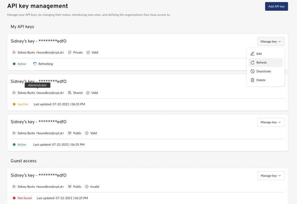
Main screen.
Let's rush through some quick details:
- The users? System administrators.
- Case? Sentence case.
- The tone? Pragmatic and clear, with occasional flickers of care and personality.
I'm quite fond of the work the designers did with this product. It's very functional and intuitive. My goal here was to make sure that the copy reflects the same basic principles.
Since this is an enterprise product, my goal here was not to overcrowd the UI with guidance copy. Instead, we opted for tooltips for all possible terms and concepts like Valid, Private, Shared, etc. This allows us to keep things tidy while also providing access to essential information at all times.
The subtext below the headline on the top is a very clear and straightforward outline of the main actions the user can perform within this product:"Manage your API keys, by changing their status, introducing new ones, and defining the organizations they have access to. "
(Yes, there is a preposition at the end of the sentence. Sue me.)
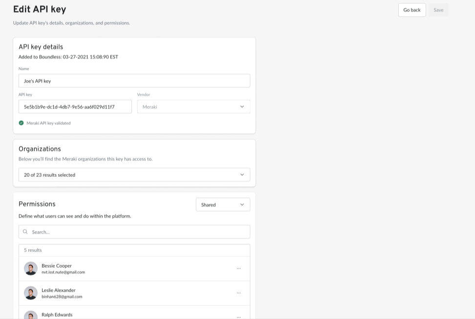
Editing the API key.
When users add an API key to Boundless (which happens in a different flow), they also select the organizations assigned to the key that they can manage via the platform. The user can then enable and disable the available organizations in Boundless and grant different permissions to other users.
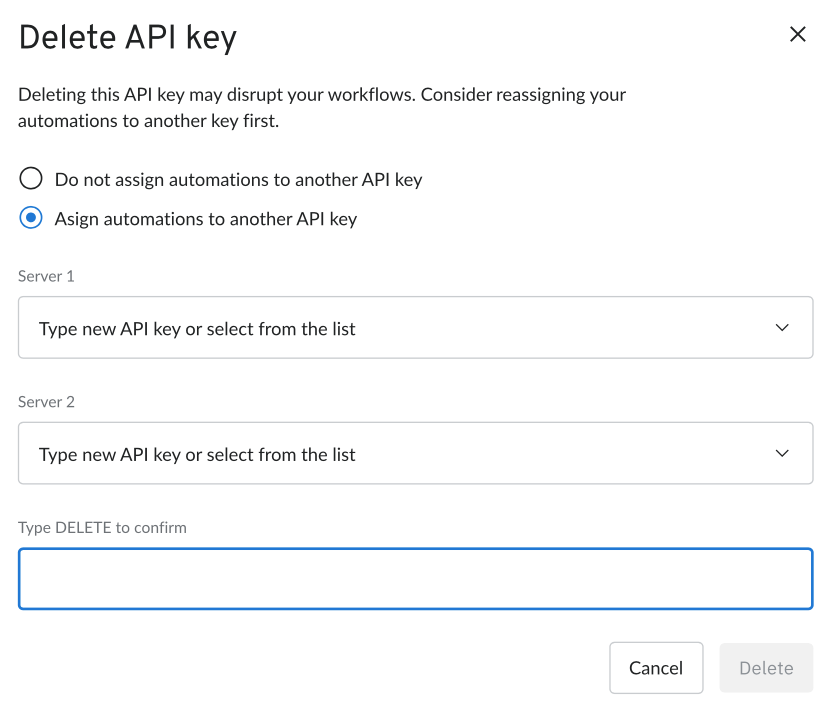
Adding friction.
You'll notice that deleting an API key comes with some intentional hurdles. Accidentally deleting a key can come with severe ramifications to the organization's workflows, which is why the tone here aims to alert the users of the consequences and recommends that they reassign the automations to a different API key.
Similarly, they have to type DELETE to be actually able to press the Delete button. This approach prevents users from making rushed decisions by introducing extra layers of friction.
This is another example of "Enterprise UX" at play.
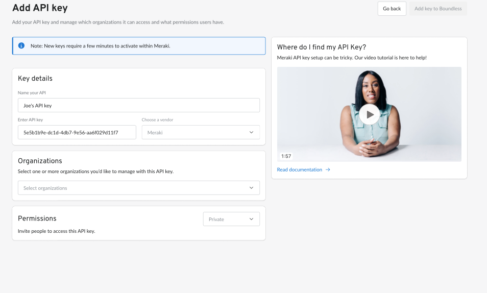
Adding keys.
I like this screen.
The subtext above informs users about the range of actions they can perform on this screen: "Add your API key and manage which organizations it can access and what permissions users have.
Users are also informed that a newly generated key can take a few minutes to activate in Meraki, reassuring them that everything is under control if new keys don't connect to Boundless right away.
To provide some extra guidance, the headline and subtext on the right reassure the users, helping them locate or set up their API key.
Basic API actions.
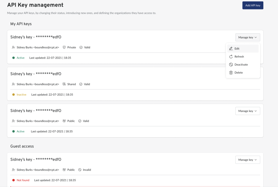
The user can access any essential actions from the main screen. They can edit, refresh, deactivate, or delete the key.
- Edit: Update API key's details, organizations, and permissions
- Refresh: Ping Cisco Meraki to get updated information about the key.
- Deactivate: Let the key nap until further notice.
- Delete: Erase it from the platform entirely.
I decided to name the containing button "Manage key," so that the user understands the exact object of these actions, given how costly and time-consuming fixing unwanted mistakes can be.
This is going to be a central consideration of my approach to copy in this interface—the user has to feel confident about the actions they're taking.
This is one of four products that Boundless is currently redesigning, to which I've contributed with copy and overall UX recommendations.
This case study will eventually be updated when API Key Management goes live.
Thank you to the fine people at Boundless for allowing me to write this short case study up.
Thank you for reading. Have a good one ahead.